


Speedo On was in the cloud, at your fingertips and we wanted to put it on your wrist. Never miss a single stroke again with the Speedo On Wearable app on the Samsung Gear Fit2 Pro and the Samsung Gear Sport.
Agency: Mediablaze | Client: Speedo | Involvement: Lead UI & UX | Visit: on.speedo.com/samsung
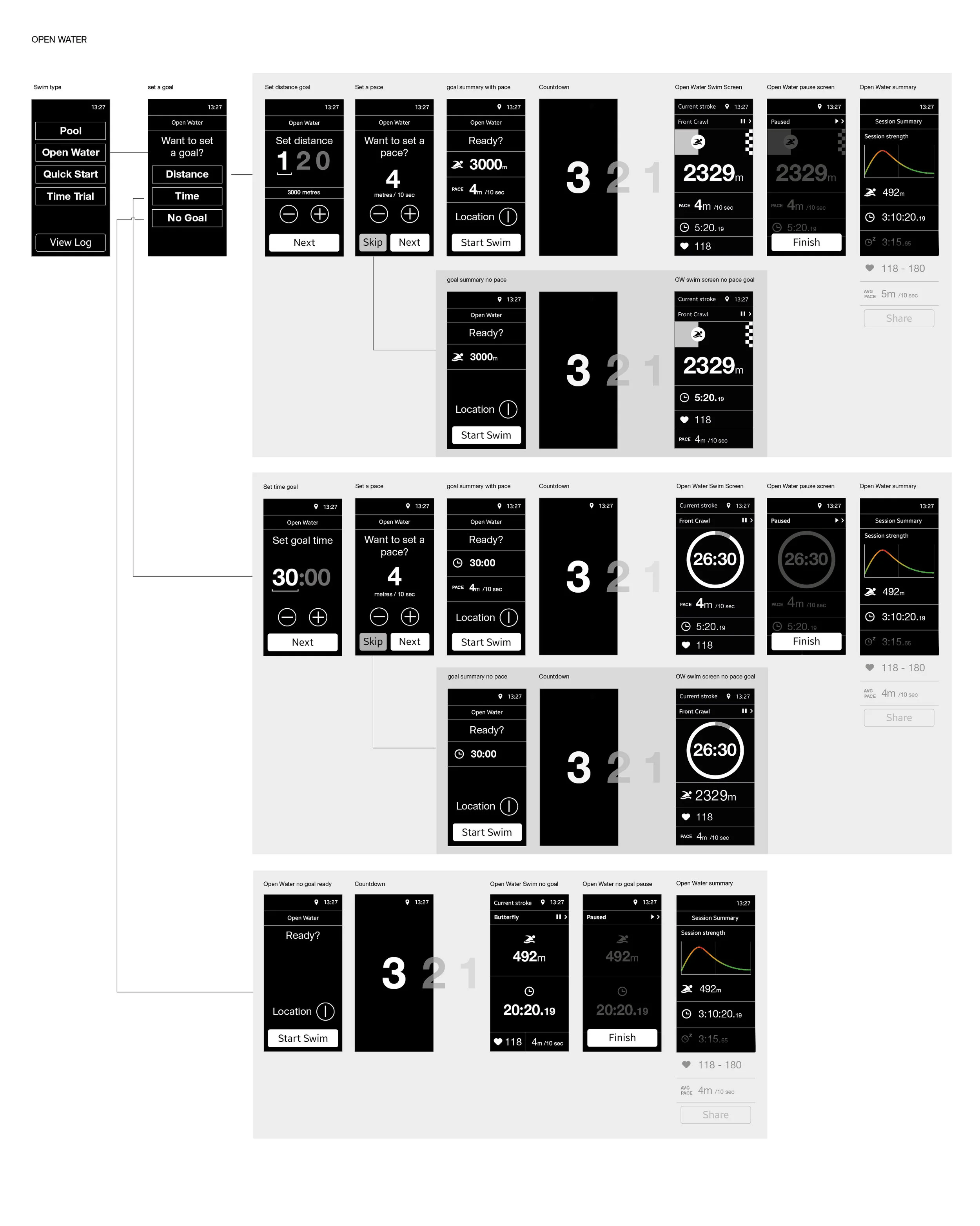
Samsung and Speedo were partnering up to bring the Speedo On application to consumer's wrists. This would mean that user's wouldn't need to worry about manually recording their swims and they would benefit from deeper analysis including pace, stroke count, time and distances.
The first thing we needed to research was how the watch itself worked. How did you navigate? What was natural to the Tizen OS that the watch ran on? These were difficult things to know as the specific models we were designing the app for weren't yet released and we had limited information.
The Samsung Gear Fit2 Pro, fortunately is the same display specification as the Samsung Gear Fit2. The only difference being some connectivity capabilities and the Gear Sport being able to track in the water.
I started creating user journeys based on the information we had and the use of the hardware buttons on the device itself.
Due to the device's proportions and display spec, we couldn't use InVision to create a prototype, so we used proto.io which allowed us to use custom specifications. Try out the interactive wearable prototype (There is a hardware button on the device itself on the right hand side for going 'back' so please use your browser's button to imitate this feature.).
The display spec of the Samsung Gear Fit2 Pro is 216x432 at a resolution of 144dpi. This meant that the screen itself measures at 1.5" diagonally. The considerations in the UI regarding type sizes, button sizing and any graphics needed to be carefully considered.
I used the Tizen OS guidelines (which cater more towards Samsung's round-shaped faces) to ensure that icons and text were legible and used native styles for buttons, this ensured that for users of the device, the navigation felt intuitive.
Samsung were due to release the Gear Sport later in the year and we were briefed on creating the same application for the device.
The User Journey from the Gear Fit2 Pro application was still relevant for this device. The only changes that needed to be made were UI based.
Using the Tizen OS guidelines I designed the new screens using the Gear Sport's unique rotating bezel navigation. Due to the elliptical shape of the Gear Sport's screen, it was a natural fit for time based information and it made for a richer experience.