


A software company offering a platform for leisure operators approached Mediablaze to conceive and develop a new white label product for their customers to switch to from their existing product offering.
Agency: Mediablaze | Client: Undisclosed | Involvement: Lead Product Designer | Visit: Not yet live
The client had an existing product and they were looking to add another product option for leisure operators to upgrade. The objective was to provide an updated user experience and interface to offer their customers much more flexibility and control.
To define the project scope, roadmap and effort, we began with a two day workshop with the client and identified Significant Interest Groups. These were key operators that use the product to offer their customers a way of signing up to memberships and booking classes online.
As the Lead Product Designer in the Mediablaze product team, I led these workshops to help define personas and he roadmap for the product using Customer Journey Mapping techniques. These outcomes would then be rated using MoSCoW scoring and measuring effort to define what the priorities would be.
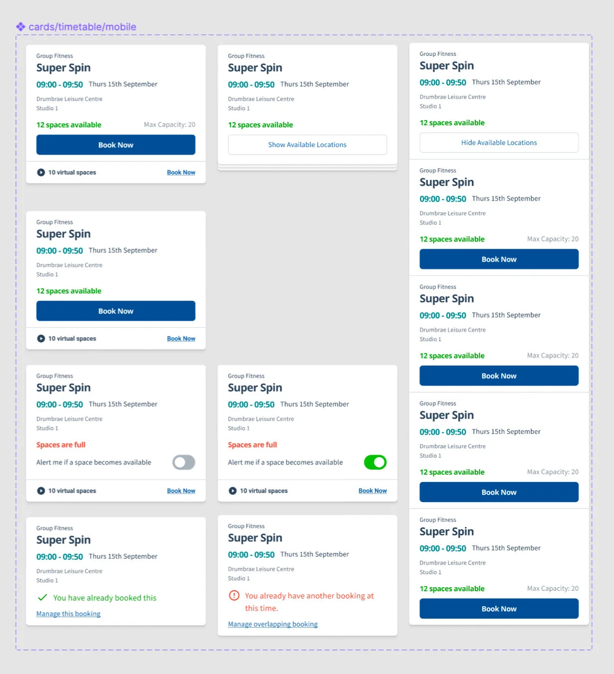
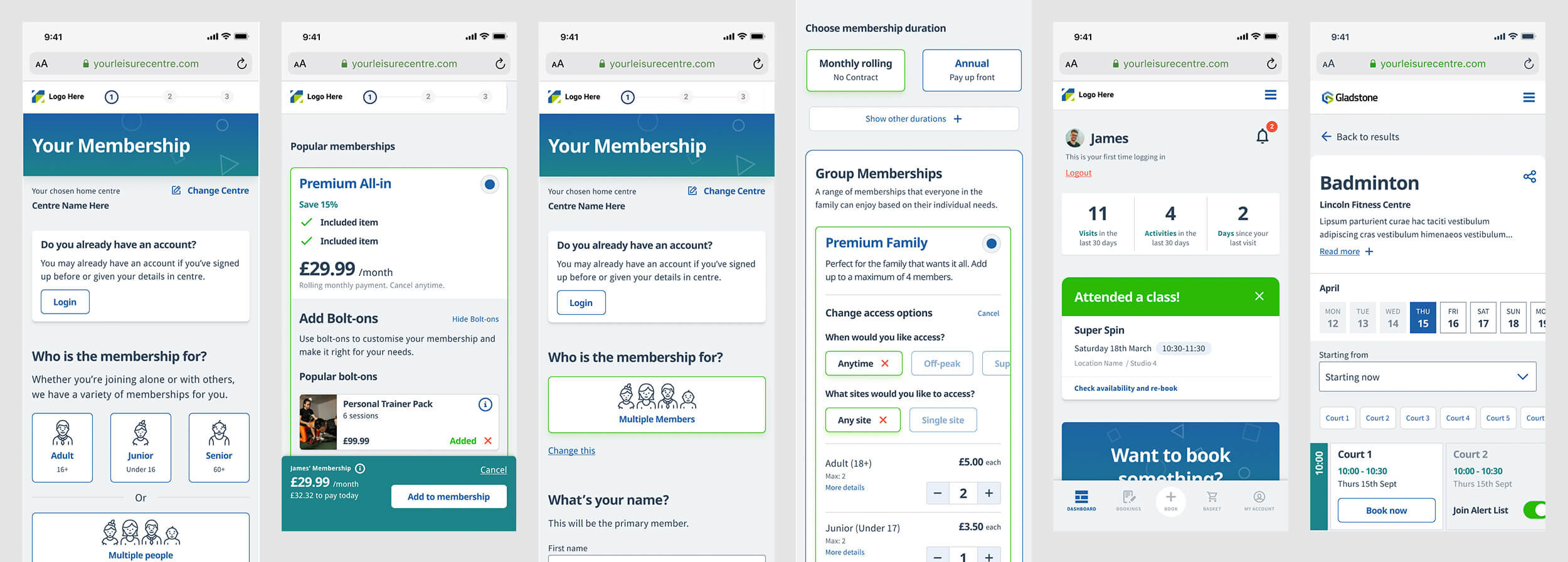
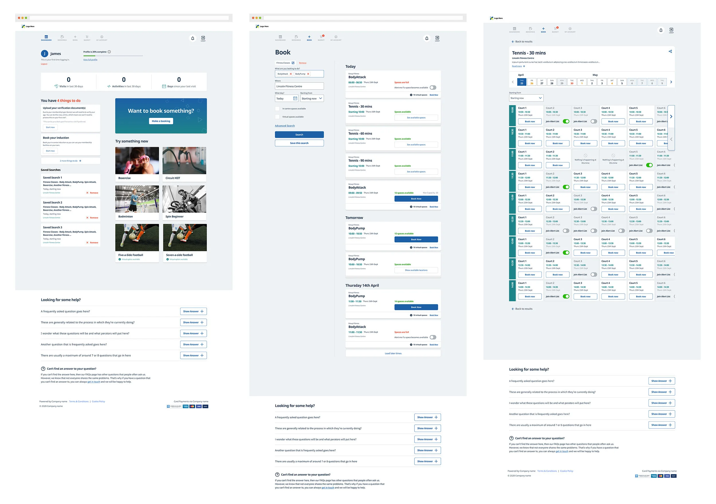
Once priorities had been agreed, working alongside the Product Owner and the client, we began wireframing and conducting user tests with a mobile first approach. These were made in Figma and we used user interview techniques and rapid prototyping to test and iterate on the flows.
This allowed us to mitigate as much risk as possible early on, ensuring we devoted our efforts on the right areas. This also gave Engineering a chance to begin measuring development effort and plan accordingly as we began to see the product take shape.
Once the wireframe structures were agreed, we were able to begin to put together the foundations of the design system for the product.
With this being a white label product, we were limited with some of the elements of customisation and flair we could offer. The operators needed to be able to easily theme and customised the front-end, change any imagery, icons, colours and typography. We ensured to use a consistent design system and colour theory throughout so this would be easier for the operators to modify later.
Starting with this solid foundation enables the team to work independently without inconsistencies developing across the UI.
We used the Atomic design principle to create a library of components for use across the platform. We developed use of the “Slot” technique, which allowed the team to build up components using nested components, ensuring consistency across the design.
This reduced time consuming checks and enabled us to rollout the design more efficiently. It also meant any iterations or tweaks that needed to be made over time were really quick to make and rolled out across the designs.